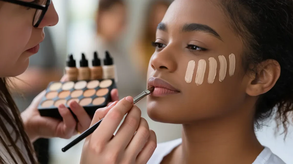
The right foundation match is decided by two separate readings: your surface tone (fair, medium, deep) and your undertone — the fixed warm, cool, or neutral cast underneath. Shade depth is the easy half; most brands now stock 30 to 50 depths. Undertone is where matches fail, because a shade can be the right darkness yet still sit orange or ashen on the face. Makeup artists resolve it with three checks — veins, jewelry, and a jawline swatch — in that order.
BEAUTY RING publishes information, not cosmetic or medical advice. Undertone is an observation skill, not a diagnosis, and if a product stings or provokes a reaction, stop using it and consult a dermatologist. What follows is the technique professional artists describe in their own tutorials and masterclasses, organized so you can run it at home in about ten minutes with nothing but daylight and a mirror.
What is undertone, exactly?
Undertone is the constant hue beneath your skin's surface color. Surface tone shifts with sun, season, and irritation; undertone does not. It is usually described in three categories: warm (golden, peachy, or yellow cast), cool (pink, red, or blue cast), and neutral (a balance of both). Olive skin — common across Mediterranean, South Asian, and Latin American complexions — carries a green-gray undertone that standard warm/cool labels often miss, which is why olive readers frequently report that even "correct" depth matches look wrong.
The distinction matters because foundation pigment is built the same way. A shade labeled 220N and one labeled 220W can be identical in darkness yet different in their pigment balance. Industry shade systems make the split explicit: many brands now suffix shade numbers with letters — W, N, C — or spell it out, as Fenty Beauty does with its range of undertone descriptors within each depth tier.
Do your veins really tell you your undertone?
Partly. The wrist test is the fastest first pass. Look at the veins on the inside of your wrist in natural daylight: veins that read blue or purple suggest a cool undertone; veins that read green suggest warm, because green is what blue veins look like through yellow-toned skin. If you genuinely cannot decide — some veins look blue-green — that ambiguity itself is a data point pointing to neutral or olive.
Treat the test as a first filter, not a verdict. Makeup artists note that wrist skin is thinner than facial skin, and visible veins say more about translucency there than on your jaw. It works best on people whose wrists match their face; if you have significant redness on the cheeks but neutral wrists, prioritize the swatch test below.
Does gold or silver jewelry settle it?
Usually, yes — and it is the check artists lean on when veins are inconclusive. If gold jewelry makes your skin look lit from within and silver leaves it slightly dull or gray, you run warm. If silver flatters and gold looks brassy against you, you run cool. Looking equally at home in both points to neutral. The logic is simple color theory: warm metal echoes warm pigment, cool metal echoes cool pigment. Do this in daylight too, and judge by which metal makes your skin look clearer — not by which metal you prefer.
How do you swatch foundation correctly?
This is the decisive step, and the one most often done wrong. The goal is to test on the jawline — the boundary between face and neck — because your foundation has to bridge both. A shade that disappears on the cheek but sits on the neck as a stripe is the wrong shade regardless of how it looks in the bottle.
- Swatch two or three candidate shades as short vertical stripes on your jawline, about a finger's width apart.
- Wait five minutes. Many formulas oxidize slightly as they meet skin oils, shifting a half-tone darker or more orange; artists swatch in-store, then check again after walking around the floor.
- Look in natural light — near a window, or step outside. Department store and drugstore lighting both skew color; warm tungsten light will make a too-orange shade look fine.
- The winner is the stripe you stop seeing. Not the one that "looks pretty" — the one that vanishes.
If you are between two depths, makeup artists' standing advice is to take the deeper of the two only if your neck is visibly darker than your face; otherwise take the lighter and warm it with bronzer. A slightly light foundation is correctable; a too-dark one reads as a mask.
Related stories: How to Keep Lipstick From Bleeding Into Lip Lines: The Artist Method · How to Clean Makeup Brushes — and How Often Dermatologists Say To.
Which undertone labels should you look for on the bottle?
Brands encode undertone differently, so learn your brand's code before buying online. The common patterns:
| Label code | Meaning | Suits |
|---|---|---|
| W, WN, or "warm," "golden" | Yellow or golden pigment base | Warm and olive undertones |
| N or "neutral" | Balanced pink and yellow | Neutral undertones |
| C, "cool," "pink," "rosy" | Pink or red pigment base | Cool undertones |
| P, "peach" | Yellow plus pink correction | Sallow or dull-leaning skin |
Codes are not standardized across brands — a 4W in one line can differ from a 4W in another — which is why the jawline swatch beats any letter system when you can get to a counter.
Can you fix a foundation that is the right depth but wrong undertone?
Often, yes, within limits. A foundation that runs too pink for you can be warmed with a yellow-toned mixing pigment or a drop of a deeper golden foundation. A foundation that runs too orange cannot reliably be cooled at home; blue mixing drops exist, but they are finicky in small volumes. Professional color-correcting drops from brands like Temptu and Danessa Myricks are formulated precisely for this, per the brands' product documentation. The general artist rule: correct depth first, undertone second, and never expect a mixer to rescue a match that is off by more than one step.
What about olive and deep skin tones?
Standard warm/cool binary underserves both. Olive undertones — that green-gray cast — often need shades labeled "golden neutral" or explicitly "olive," and a growing number of lines (Lisa Eldridge, Danessa Myricks, and others) list olive as a category. For deep skin, the failure mode is different: many legacy ranges stopped at 8–12 shades and stacked their deepest tiers with only red-based pigment, so deeper warm and olive tones found ash or gray matches. The fix is the same swatch discipline — check that the stripe disappears along the jaw — plus a gray-check: if the swatch looks ashy in daylight, the pigment base is too cool for you regardless of depth.
Does undertone change other makeup choices?
It runs the whole face, which is the quiet payoff of getting it right. Blush, bronzer, and lip picks that share your undertone read as "your skin, but better"; the wrong family reads as separate paint. Cool undertones generally get more from berry, mauve, and blue-red pigments; warm undertones from peach, terracotta, and orange-reds; neutrals can cross between families. The same logic applies to concealers for color correction — a peach corrector cancels blue-toned darkness, and a yellow tone brightens sallowness — which is why undertone is the one piece of color theory worth ten minutes of anyone's time.
Artists' shorthand: depth is measured, undertone is observed. Every test above is just a structured way of observing under honest light.
None of this requires buying anything first. Run the vein and jewelry checks, then swatch on the jaw in daylight, and the shade that disappears is your answer — no counter consultation required.